Sunday, April 15, 2007

Easy "Watercolor" Backgrounds

This is a short tutorial on how to make a "watercolor" style page background with a wax resist design. I do these in art journals or whenever I need a colored BG, but fast. The supplies you'll need are: A piece of paper (I prefer watercolor), or a journal with decent paper, 2-5 different colors of dye based ink stamps, a clear wax crayon, a spritz bottle with plain water, and newspaper or other protective surface to work on.


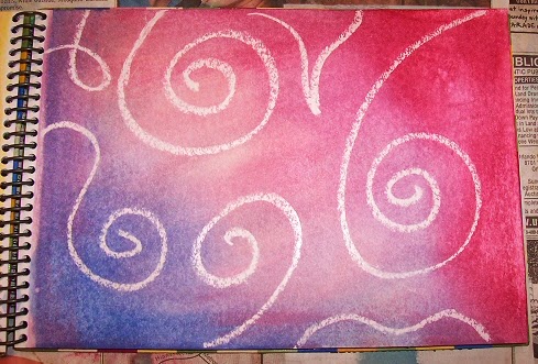
Start by using your clear wax crayon to make a design on the paper. I have a stash of Easter egg color kit "magic crayons" that I use just for this purpose. It will be hard to see your design, so I usually stick to abstract swirls and random squiggles. You could always try colored paper I suppose, but keep in mind that will alter your ink hues too. Then choose your ink colors - in the examples here I used Rubber Stampede's dye based inks in the little single serving size pads. Here's where you need to work quick: Spritz the paper lightly with water so that the entire piece is just damp, then apply the inks directly to the paper (DTP) by rubbing and swirling them around until you get the coverage that you want, blending them around and on top of each other. You will instantly see the design appear where the wax crayon "resists" the ink. Then I use the spray bottle to spritz droplets of water onto the paper, randomly and using varying pumps of the sprayer (from fine mist to large splats of water) to further water down the ink on the page - and once they dry completely the effect is pretty cool:


Closeup detail from same page:


And thats really it - you can add as much or as little (or none!) water as you like, and you can leave it as droplets like I did here, (I did it in layers with a fine mist on the bottom - letting that dry - then dropping larger splatters on top of that) or use a damp paper towel to wick up some of the drops and remove even more of the color. Or use the same to smooth and blend the colors further - up to you, just play around with it! Of course how yours turns out will depend on the paper and / or inks used (some papers will suck up the ink too fast or other dye inks will bleed through and not blend as nicely) but it's such a quick and easy process you really can't go wrong, so just try everything - at the worst you'll end up with a bunch of scrap BG papers to use in collages and other altered art stuff!


Thats it for today - I do have a different background making technique I'll post another day - it's my main "go-to" style when I need to make BGs for use in ATCs or art squares or 4x6 collages or whatever ... so 'til next time!

~ gem ~

Monday, April 2, 2007

Postcard Project

I joined this postcard project over at Nervousness at the beginning of the year - got my "blank" card a week or so ago and set out to alter it this morning, using the "prompted collage" technique I learned about from eliza-jane, who I think learned it from artsymama and so on and so forth (like I have time to backtrack to the absolute origination of any tip or technique, YAH!) but I really like this process as it's sooooo easy and fast - you can knock out an ATC or 4x4 or postcard or even bigger piece in like minutes (depending on how long it takes any one elment to dry or set, etc ...) but you still feel like you really stretched you creativity and went outside some of your normal borders. So it's nice especially if you find you get into a sort of rut doing the same process and elements again and again in your artwork. (Then again I'm bad about putting back and re-fishing around in my prompt can if I don't get the element I want at the time I want it, heh.) Anyway. On with the show!

Goal here is to take this postcard:


and alter it into my own piece of art, then send it back to the host who will collect them all and then exhibit them in a local arts center. The only prep work I did to the card before starting the process was to lightly sand off the glossy topcoat (as seen above) and then I pulled out my first prompt:

PAINT I have a new bottle of acrylic paint in the shade "Passion Punch" so I used that, just dry brushing it randomly across the front in horizontal strokes.

Next was PATTERN so I found a similar hued piece of scrapbook paper with a wave pattern and glued that down along one side.


Then came STAMP, so I used my trusty swirl rubberstamp and dipped it into some antique white acrylic paint and randomly added the swirls. Here we are so far:


The next prompts I pulled were SCRATCH - using an opened paperclip I scratched some straight lines throughout, especially over the original qutoe text. Then I got CHARCOAL and edged around the patterned paper - and right there is where this piece really came together for me, I think:


After that came SMUDGE (well, wasn't thaaat lucky?) so I smudged the charcoal with my finger to work it into the paper ... INK was next so I took my black StazOn pad and inked the edges of the card (something I have to do to almost everything I work on, habitually!) then for SURPRISE I used a shaped punch to add two openwork stars through the patterned paper. SPATTER was next (I explained this in another art piece description on flick'r, but "spatter" wasn't one of the original prompt words in the list I copied - I took the typo patter to mean Spatter but it was actually supposed to be patterN ... So I just left them both in. It's just art - you can still do what you want you know.) Anyway I love paint spatters on stuff so I was happy to see this one turn up, though I did make my paint mix just a tad too wet here. Lookin' good so far:


Only one prompt to go (I usually stop at ten) and what do I get?
TEXT - not so bad I think ... I go and pull the entire quote for the Plath-itude that was on the front of this card when I started, print it up in a nice little font and cut it out - ink the edges, and before I attach it realize the white paper is too stark so I lightly sponge some of the leftover spatter paint mix onto the text, then re-ink the edges, then attach. And BAM! just like that it's ruined!


So now I DO NOT like that final piece on there, and only added it thinking it would "tie" the whole thing together with the original underlying quote and the full quote on top (plus the fact that it mentions writing and after all this is a postcard ...) I don't like how large the text field is (even though I used a real small font and the lowest possible point size) or the angle at which I placed it. Shoulda just used the last part of the quote, but ah-well! It's done now. I brushed a topcoat of satin varnish on as a protectant (mostly for the charcoal) and now it's pressing flat so I can mail it tomorrow. YaY. Here's the final, finished card:


Oh and while I was working on this I noticed my son's clay art project for school is cracking as it's drying (yeep!) - but - thats another story for another day!


See ya :)
~ gem ~

Sunday, April 1, 2007

A Hot Mess


Working on some swap art this weekend - ATCs and decos mostly. The April Showers ATC swap at Nervousness is due soon and I finally sat down to make my cards today - I usually work intuitively without any real plan or idea, but this time I came up with what I thought would be cute idea for the theme and didn't figure on it being so hard to get the idea from brain to paper.

Plan was to use a paper drink umbrella and add "rain" in the form of embroidery floss and beads. Well it turned into a hot mess, real quick - the umbrella part was okay but I'm just not great at sewing and then the beads wouldn't fit over the needle (these were choice 5, I think) and so then I got pissed when it didn't happen and I added the handle & cap in Sharpie and thaaaat made it better, yes? -sarcastic eyeroll faces here-


Anyway. I went another route which turned out okayyyy, but I just get annoyed when I have the perfect idea for a project and then for whatever reason can't manage to pull it off in the exact way I envisioned it.


~ gem ~