I just finished a set of postcards for a Zetti-themed swap at Swap-Bot and thought I'd share my process step by step, so you can see how easy (and fun!) it is to make some really cool art. I originally made 5 cards but I am documenting the process on the 6th card (the one I decided I had to make and keep for myself 'cause I was getting very attached to the others and feeling like I didn't wanna send them off ... ) I added pictured of each step, like I usually do - I tried to keep them small here but click on them to view fullsize and see the details better. So here we go!
I start almost all my collage pieces - but the Zetti-inspired work specifically - with a handpainted background paper. Whenever I have some extra time with no projects going on (or I'm just bored & in the mood to make BGs!) I make a batch of handpainted papers so I always have a stash handy for other projects - most are watercolor or acrylic washes on watercolor paper, the kind I make using the "salt" effect. (If I haven't posted a technique tutorial on that yet, I will try to get one up soon). I cut the paper down to size for whatever I am making, in this case 4x6 cards for a postcard swap. I build my layers starting with the base (the cut-down BG paper, prepainted) then add some rubberstamping, usually with a large background or text-block type stamp, or a foam stamp in one of those architectural designs (fleur-de-lis, gothic crosses, whatever looks cool at the time). I switch off between using ink colors that coordinate or contrast, depending on my mood. Here I am using a golden yellow chalk ink and a large harlequin BG stamp:

Next I move on to the collage pieces. I work with alot of different image sources - from vintage image CDs or collage sheets I have purchased, vintage photos I've found or bought and then scanned, magazines of all kinds: high fashion mags are great for interesting faces and eyes, plus the clothing has cool patterns for turning into crowns or hats or even new "clothes" for your collage person; I love using fishing magazines for fishbodies and eyes; garden mags for birds and butterflies - even junk mail gets saved if it has cool images I can use later. Another great source for images, especially vintage ones is in the Flick'r groups. Now, I don't mean go into Flick'r and just use anyones images whenever you like - I am talking about specific groups that are set up for this and allow access to their images for use in artwork (alot of times they are public domain images that people have uploaded, but please read all the rules of whatever group you join before ya just download & print, mmmkay?)
So! In this case what I've done is cut out some ladies heads from fashion mags and then worked on finding new eyes to go with each face. I look for ones that give the face some odd character or an unusual expression (TIP: turn the new eyes UPSIDE DOWN, it gives them that real weirdly creeped out effect), even if they are too big for the head, you can either leave them if you like that look, or trim them to fit the face, whatever you want. Cutout a bunch of eyes and mix and match them to the faces until you get the perfect one (You'll know, it's the one that grabs your attention and makes you say "Yep, that's it!")

After I get the faces done - eyes chosen and glued down, faces cutout and trimmed down if need be, I sometimes edge them with ink or a Sharpie - then I move on to the bodies. I like to use fish or bird bodies, or cutout some kind of random body-blob shape from a magazine page (look for cool patterns on clothing, textured-y backgrounds like hair from shampoo ads, a blue sky with some clouds, whatever!) I decided to go with text background (from an old Jules Verne biography thats in French) for the vintagey look of the paper, the texture of the text, - it's interesting in itself but still with a sorta neutral nature that will let the rest of the collage stand out. I cut them into triangular shapes and gave the pieces a bit of color with a chocolate brown dye-ink pad, just randomly swiping it around a little and edging all the sides real good. I attach the heads, and look: my little beauties are starting to take shape!

At this point I have my final layout pretty much set; once I get the basic collage shapes done, I can see what their sizes are in relation to each other and I take a minute to arrange them on my background, moving them around a bit, maybe flipping or turning the BG paper to see what looks best. Once I have it in my mind how they'll be going onto the page, I can add the other elements - this way I can make sure I keep everything sized right and in balance. So! I work on finishing the bodies now, adding wings or arms or legs ... I use alot of butterfly wings!, I know! but the trick so they don't always look the same, is to maybe only use half the wing, and just on one side of the body - or, turn them upside down - or, add two pairs together ... you know: be creative! I made a pair of wings out of a dog's ears from a magazine ad (he was a ... what's the one? Papillon? and doesn't that mean butterfly in French? HAHA! figures ...) Also mascara ads are great - the "swipes" from the wand, you cut them into the right shape and tada! black & white striped wings, hooray! Anyway here's what they look like so far (and yes I work a bit messy. It's okay.)

Time for some accessories - if you're a fan of Zetti you know a big part of that is usually the incorporation of crowns and dunce-cap style hats. Now, not everyone likes those and that's cool - I don't think they HAVE to be included to be considered Zetti, 'cause you're supposed to do whatever comes to you creatively and not just stick to some set of "rules", right? Right now I do add them 'cause I DO like them. But you do whatever ya want, ya herr me? Look, see: I gave one gal a headband instead (cause I really loved her red hair and didn't wanna cover it all up)

Nowwwww were starting to look like something, here! In between steps I always put the figures back in their places in my layout, to keep testing if I still like it that way and make sure everything is fitting together well. In this case I actually found something I wanted to change (see if you can spot it in the next picture!), so I made that adjustment and then when I was sure everything was just how I wanted it, I glued the collage pieces down to the background. By the way I am just using a glue stick for all this work, in case you were wondering. And my current favorite is this Extra Strength glue stick by Elmers - it's about an inch wide, goes on sooooo nice and smooth, has excellent adhesion, and - IT'S NOT COLORED BLUE OR PURPLE! (well, actually if you really look at it, it's got a very faint blueishgreen tint, but ... nothin' like those creepy blue or purple ones. ewww.) And now that my pieces are glued down, it's time for the finish work:

What I do is gather up some assorted markers and gel pens - metallic, glittery, opaque white gelpen, neutral brown Sharpies to edge things for shadow effects, pinks for cheeks & lips and maybe even blue or green for eyes and random highlights of color. Then, ya just go to town! Add accents to eyes, eyelashes, paint in cheeks or lips or eyes, add color or lines to wings or hats, add jewels to crowns - whatever you think might look good, probably will! For these cards I went a step further: I scanned a copy of this card I made here (since I am keeping it, no one will get to see this one) and in my image editor I lowered the opacity to about 25% then printed it at 4x6 size, and attached those copies to the back of the cards. It's clear enough to see the image but faint enough that I can write my message and the addresses on the back of the cards and they're still readable. Very last step is to press them flat and make sure that back print is well adhered, I put them in between layers of wax paper and put the whole bunch under a stack of books at least overnight. And since these are postcards that will actually travel through the mail, I will finish them by sealing them with a coat or two of acrylic sealer and let that dry/cure before mailing. The final version is the top-right image up there, the one I have in my Flick'r.
Well! Hope you liked reading my card making process, but what I really hope is that you were inspired to go right now and make your own Zetti collage creation! You can use this technique for postcards, ATCs, 4x4 art squares, journal book pages, decos, pretty much anything you wanna make a collage on or in! So, have fun and see ya soon!
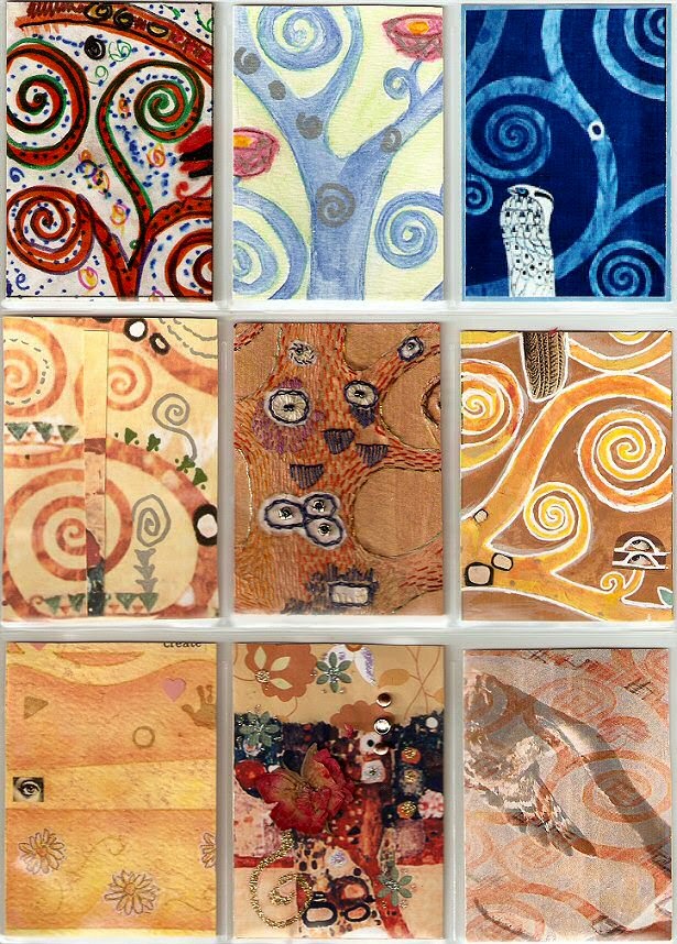
** by the way ~ if you viewed any of the Zetti postcards in my Flick'r, you should know that my two favorites were #1 and #2 ... they came out just a little nicer and brighter, and that's because I started those on a smaller piece of handpainted BG paper, and when I got to the rest I didn't have any more of that exact paper so I had to use a piece that was similar - but it was lighter so those just don't pop as well as the first two. Jus'saying ...
~ gem ~
OH YEAH! and the part I changed in case you didn't catch it - the gal on the far right - I had to change her wings out ... the first pair just weren't working with the rest of the piece once I got that far, so I swapped'em for some yellow one and put them both to one side. Muuuuch better!